
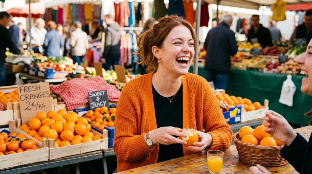
What Is “Orange”?
Orange is a warm color positioned between red and yellow on the visible color spectrum. It is commonly associated with sunlight, fire, autumn leaves, citrus fruit, energy, and warmth.
In traditional color theory, orange can be created by combining red and yellow. Its exact appearance depends on the proportions used and the color system being discussed.
What Does Orange Look Like?
Orange generally has a warm appearance that can range from bright and vivid to muted and earthy.
Common shades include:
Bright orange
Tangerine
Pumpkin
Burnt orange
Amber
Peach
Coral-orange
Rust
A yellow-orange shade may look lighter and more cheerful, while a red-orange shade can appear much closer to red.
What Does Orange Represent?
Orange is often associated with:
Energy
Creativity
Warmth
Enthusiasm
Friendliness
Adventure
Youthfulness
Because orange combines qualities commonly associated with red and yellow, it can appear energetic without being quite as intense as pure red.
Examples of Orange in Everyday Life
Orange appears in many familiar objects and natural settings:
Oranges
Pumpkins
Autumn leaves
Traffic cones
Safety clothing
Fire
Sports uniforms
Advertising and branding
Its visibility makes it useful for situations where something needs to attract attention.
Short History of Orange
The color existed long before the modern English word orange became common. Historically, different languages used descriptions related to yellow and red before the color received its modern name.
The English word orange became associated with the color through the name of the orange fruit.
What Is “Red”?
Red is a primary color in traditional color systems and occupies one end of the visible spectrum. It is one of the most visually powerful colors and is frequently used to attract immediate attention.
Red is commonly associated with:
Passion
Love
Danger
Power
Energy
Urgency
Heat
Strength
Its meaning can change considerably depending on the situation and culture.
What Does Red Look Like?
Red ranges from bright, vivid shades to dark and muted tones.
Common varieties include:
Scarlet
Crimson
Burgundy
Cherry red
Ruby
Maroon
Carmine
Vermilion
Some shades of red contain more orange or purple, which can make them look significantly different from one another.
What Does Red Represent?
Red often communicates strong emotions or signals.
For example:
A red heart can symbolize love.
A red warning sign can communicate danger.
A red traffic light means stop.
A red rose can symbolize romance.
Red clothing can create a bold visual impression.
Because red naturally attracts attention, designers often use it when immediate visibility is important.
Short History of Red
Red is one of the oldest colors used by humans. Ancient people produced red pigments from naturally occurring minerals and other materials for artwork, decoration, clothing, and ceremonial purposes.
Red has also developed rich symbolic meanings across different societies throughout history.
Orange or Red: Key Differences
The most obvious difference between orange or red is their position and composition in the color spectrum.
Key Differences
Red is generally deeper and more intense than orange.
Orange contains a strong yellow component.
Orange sits between red and yellow.
Red is commonly associated with passion and urgency.
Orange is often associated with warmth and enthusiasm.
Red usually creates a stronger visual impact.
Orange can feel more playful and approachable.
Red is commonly used for stop and warning signals.
Orange is widely used for visibility and caution.
Both colors are warm and attention-grabbing.

Orange or Red Comparison Table
| Feature | Orange | Red |
|---|---|---|
| Color family | Between red and yellow | Primary warm color |
| Appearance | Warm, bright, yellowish-red | Strong, intense, deeper |
| Common associations | Energy, creativity, warmth | Passion, danger, power |
| Visual intensity | High | Very high |
| Common natural examples | Oranges, pumpkins, autumn leaves | Roses, cherries, blood |
| Safety use | Caution and visibility | Stop, danger, warning |
| Emotional impression | Friendly and energetic | Powerful and intense |
| Common design role | Playful, energetic accents | Strong calls to action |
| Position | Between red and yellow | Near the long-wavelength end of visible light |
Real-Life Conversation Examples
Dialogue 1: Describing a Shirt
Emma: Is that shirt red?
Liam: It’s actually more orange-red.
Emma: It looks red from far away.
Liam: The yellow undertone makes it look orange up close.
🎯 Lesson: Some colors sit between orange and red, making them difficult to classify precisely.
Dialogue 2: Choosing a Warning Color
Sara: Should we use orange or red for the warning sign?
Mia: If it’s a serious stop or danger signal, red is usually stronger.
Sara: What about a caution message?
Mia: Orange can work well for visibility and caution.
🎯 Lesson: Red generally communicates greater urgency, while orange can signal caution and attention.
Dialogue 3: Decorating a Room
Noah: I want the room to feel warm and energetic.
Olivia: Orange could work really well.
Noah: Would red be too intense?
Olivia: It might be if you use a lot of it.
🎯 Lesson: Orange often creates warmth without the visual intensity of large amounts of red.
Dialogue 4: Branding
Alex: Why do so many brands use orange?
James: It can feel energetic, friendly, and approachable.
Alex: So red has a different effect?
James: Red can feel more urgent, bold, and powerful.
🎯 Lesson: Color choice depends on the emotional impression a brand wants to create.
When to Use Orange or Red
Choosing between orange or red depends on the message you want the color to communicate.
Choose Orange If You Want:
Warmth
Energy
Creativity
Friendliness
Playfulness
Visibility
A youthful appearance
A less aggressive alternative to red
Orange can work especially well in designs that need to feel energetic but approachable.
Choose Red If You Want:
Urgency
Passion
Strength
Attention
Excitement
Power
Danger
A bold visual statement
Red is especially effective when you want something to stand out immediately.
A Simple Memory Trick
Remember:
Orange = warm + energetic.
Red = intense + powerful.
If a color feels cheerful, warm, and slightly yellowish, it is more likely to be orange. If it feels deeper, stronger, and more intense, it is more likely to be red.
Orange or Red in Design
Both colors can be highly effective in graphic and interior design, but they create different impressions.
Orange can add warmth and movement without dominating an entire composition. It works well for accent walls, buttons, illustrations, sports designs, and creative branding.
Red is more visually forceful. It can immediately draw attention to important information, promotions, warnings, or calls to action.
Using too much red can sometimes make a design feel aggressive or overwhelming. Orange can provide a similar sense of energy with a somewhat softer impression.
The best choice depends on the surrounding colors, brightness, saturation, and overall purpose.
Orange or Red in Psychology
Color psychology is not a universal science in which every color produces exactly the same emotional response. Personal experience, culture, context, and individual preference all matter.
Still, some broad associations are common.
Orange
Orange is frequently linked with:
Optimism
Social energy
Creativity
Warmth
Enthusiasm
Red
Red is frequently linked with:
Excitement
Passion
Danger
Love
Urgency
Power
The same color can communicate completely different ideas depending on how and where it is used.
Orange or Red in Nature
Nature provides many examples of both colors.
Orange
You can see orange in:
Pumpkins
Oranges
Marigolds
Monarch butterflies
Autumn foliage
Some sunsets
Red
Red appears in:
Roses
Cherries
Strawberries
Apples
Poppies
Certain birds and insects
Interestingly, many natural objects are not a pure orange or pure red. Their exact shade can change depending on lighting, pigmentation, maturity, and surrounding colors.
Orange or Red for Visibility
Both colors can be highly visible, but orange is particularly common in safety equipment because it stands out against many natural backgrounds.
You can find bright orange in:
Traffic cones
Construction clothing
Emergency equipment
Hunting safety gear
Roadwork signs
Red is also highly visible and has an established association with danger and stopping.
For example, red is widely recognized in traffic signals because its meaning has become standardized.
Orange or Red: Which Is Brighter?
Brightness is not determined simply by whether a color is orange or red.
A bright orange can appear much brighter than a dark red. Similarly, a very bright red can be extremely vivid.
Brightness depends on factors such as:
Lightness
Saturation
Lighting conditions
Surrounding colors
The exact shade
Therefore, it is more accurate to compare specific shades rather than assuming one entire color category is always brighter.
Orange or Red: Which Is Warmer?
Both are considered warm colors, but orange is often perceived as especially warm because it combines red with yellow.
Red can feel hot, intense, and dramatic, while orange often feels warm, sunny, and energetic.
This is why orange is frequently associated with:
Firelight
Sunsets
Autumn
Summer
Warm interiors
Red can also communicate heat, but its psychological effect is often more intense.
Fun Facts and History
1. Orange Got Its Modern English Name From a Fruit
The English word orange became associated with the color through the orange fruit. Before that, English speakers used other descriptions for similar reddish-yellow shades.
2. Red Has Extremely Ancient Cultural Importance
Red pigments were among the earliest colors used in human art. Ancient communities used naturally occurring red minerals to create pigments for paintings and decoration.